
Graphical Representation of Data / Variables
Ø The data presentation in statistics may be Numerical or Graphical.
Ø If the data is presented in the numerical form, it will not attract the attention of the audience.
Ø In order to attract the attention of the audience, Graphical Representation method is usually adopted.
Ø Graphical Representation: It is the representation or presentation of data as Diagrams and Graphs.
Ø The statistical graphs were first invented by William Playfair in 1786.
Ø In graphical data representation, the Frequency Distribution Table is represented in a Graph.
Advantages of Graphical Representation of Data
Ø Data are presented pictorially.
Ø Give better insight and understanding of the data.
Ø Makes the presentation eye-catching.
Ø The data become more logical (clear).
Ø The comparison becomes easy.
Ø Can derive the conclusion from data very quickly.
Ø Give the spread of the data.
Ø Reduce space for data representation.
Ø Helpful in statistical analysis.
Disadvantages of Graphical Representation of Data
Ø A graph cannot represent all details of the variables.
Ø Very difficult to include and study the small differences in large measurements.
Ø Graphs usually show approximate figures.
Ø Graphs are only a supplement to the tabular presentation of data.
Ø Graphs cannot be an alternative to tabular presentation.
Ø Further processing and analysis of data are not possible with graphs.
Things to remember in Graphical Representation Methods
Ø A graph should have a self-explanatory heading.
Ø If more than one graph is used in the study, all graphs should be numbered chronologically.
Ø The scales should be indicated.
Ø Sketches should be neat and clear
Ø Footnotes should be given below the graph.
Ø The size of the graph should fit in the size of the paper / PPT slide.
Ø Contrasting colours or shades should be used to separate different classes.
Methods of Graphical Representation of Data
Ø In statistics, the data can be presented graphically using many methods.
Ø Important graphical representation methods are given below:
(1). Line Diagram
(2). Bar Diagram
(3). Histogram
(4). Frequency Polygon
(5). Frequency Curve
(6). Pie Chart (Circle Diagram)
(7). Ogive
(1). Line Diagram
Ø The line diagram is the simplest method of graphical representation.
Ø In line diagram, the data is represented in the form of straight lines.
Ø Each line in the diagram represents an observation or a class.
Ø The height of the line denotes the magnitude of the observation / class.
Ø The distance between the lines is kept uniform.
Ø Advantages of line diagram: quick and simple method, comparison become easy.
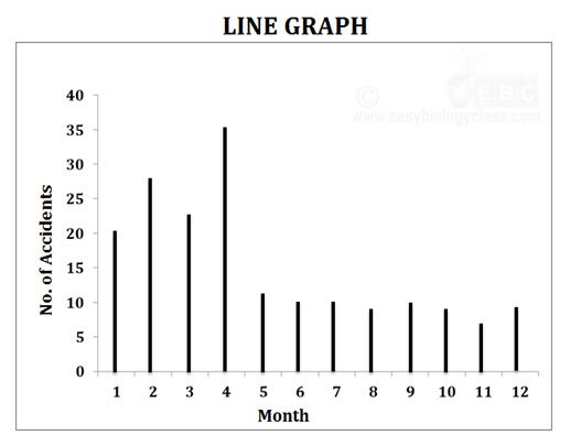
Example: A study on the number of accidents in the year 2015 in a particular area is given below. Draw a line graph to represent the data.
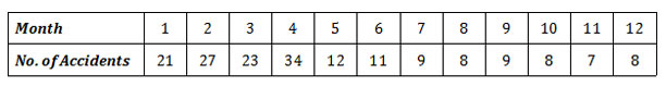
Solution
(2). Bar Diagram
Ø Bar diagram is also called as bar chart
Ø A common and simple method of graphical representation of data.
Ø Bar diagram is a chart that presents grouped data with rectangular bars.
Ø Each rectangular bar represents a class.
Ø Height of the bar is proportional to the magnitude of the item in the class
Ø Bars are drawn vertically or horizontally with equal spacing between them.
Ø The width of the bars and the space between them are kept constant.
Ø The vertical bar diagram is also called as column bar chart.
Ø In a vertical bar diagram, the independent variables are shown on the X axis, while the dependent variables are shown on the Y axis.
Ø Bar diagram is further divided into FOUR types:
(a). Simple bar diagram
(b). Multiple bar diagram
(c). Subdivided bar diagram
(d). Percentage bar diagram
(a). Simple bar diagram
Ø Items are to be compared with respect to a single characteristic.
Ø Simple bar diagram may be vertical or horizontal.
Example: Draw a simple bar diagram using the following data.
Solution
(b). Multiple bar diagram
Ø Contain two or more bars arranged side by side.
Ø Allow comparison of multiple sets of variables comparison.
Ø Different colors or shades are used to distinguish different bars in a single set
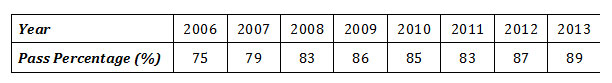
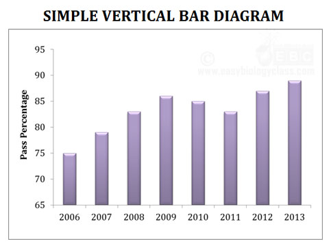
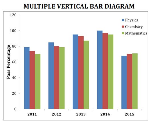
Example: Draw a bar diagram using the following data showing the pass percentage of different subjects in five years
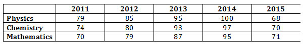
Solution
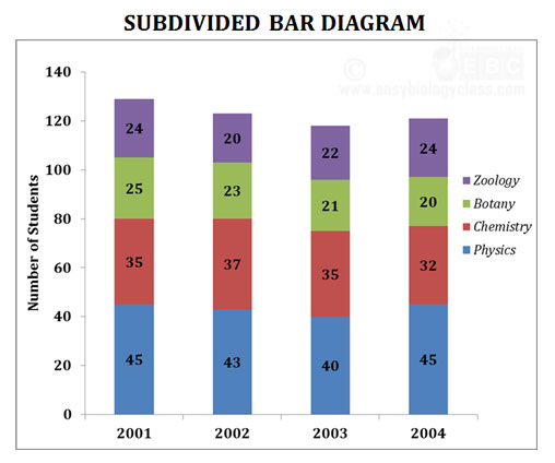
(c). Subdivided bar diagram
Ø Also called component bar diagram
Ø The individual bar is subdivided into various parts or compartments.
Ø The size of various compartments is proportional to the magnitude of the variables.
Ø Different colours or shades are used to distinguish the compartments of the bar.
Ø The distance between the bar and the width of the bar is kept constant.
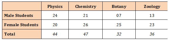
Example: Number of science graduate students in a college is given below. Draw a subdivided bar diagram using the following data.
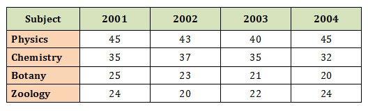
Solution
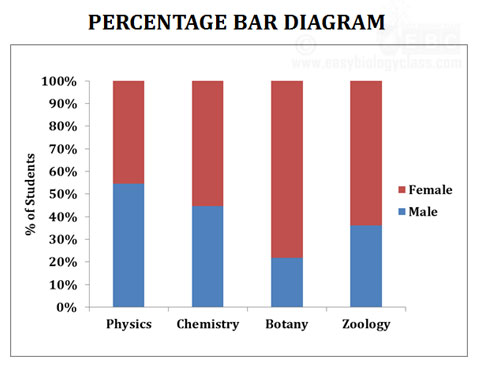
(d). Percentage bar diagram
Ø Percentage bar diagram is a diagram which exhibits a simple analysis of statistical data in terms of percentage.
Ø The length of all bars is kept constant (100%).
Ø Each bar consists of several compartments.
Ø The size of each compartment of a bar corresponds to the percentage of that component with respect to the total.
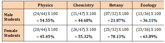
Example: Draw a percentage bar diagram using the following data.
Solution: Conversion of absolute values into percentage.
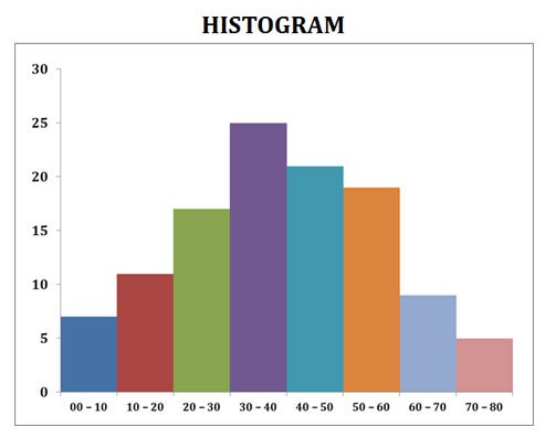
(2). Histogram
Ø Histogram is used in the graphical representation of frequency distribution.
Ø Here each class of the frequency distribution is represented as columns.
Ø The height of the column corresponds to the magnitude of the frequency.
Ø A histogram quickly tells how many items are there in each numerical category.
Ø The histogram resembles a bar diagram (but with a difference).
Ø In the histogram, the columns representing each class are in close contact and there is no space between them.
Ø The absence of inter-bar space denotes the continuity of classes in the histogram.
Construction of a Histogram
Ø The class intervals are taken on the X axis.
Ø Corresponding frequencies are taken on the Y axis.
Ø Class intervals used are usually of equal width.
Ø The frequency is proportional to the area and height of the bar.
Example: Construct a histogram using the following data
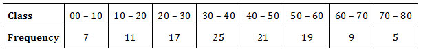
Solution:
Importance of histogram
Ø The area of blocks in the histogram clearly shows the frequency of each class.
Ø Histogram shows the spread of observations (uniformly spread or randomly spread or showing central tendency).
Ø Provide information about skewness or symmetry of data.
![]()
good one for the all kinds / level of students.
Student